This article on Order Flow Analysis is the opinion of Optimus Futures.
Editor’s Note: This article was originally published on August 6th, 2016 and has been updated for comprehensiveness.
For more than a century, standard methods of market analysis for stocks and commodities have centered around two types: technical analysis and fundamental analysis.
While both methods have their unique methods and differences, neither has observed the significant impact of real-time supply and demand—in the form of orders and transactions—on market prices.
The reason for this was technological: before the 21st century, no machines could compile the flow of orders and transactions in real-time across multiple exchanges.
But as the digital age dawned, access to this information on a large scale became possible. Out of this new capability came a new form of market analysis: order flow analysis.
What is Order Flow Analysis?
Order Flow Analysis is a type of market analysis that examines the real-time sequence of trades in a given market to determine how the sequence might affect prices in the near term. In other words, analyzing order flow is about observing the transactional mechanisms that move prices.
There are a few methods and tools you can use to analyze order flow. Let’s start with the most basic and accessible tool: the DOM chart.
Two Methods to Analyze Order Flow: DOM and Cluster Charts
For analyzing order flow, two main tools are Depth of Market (DOM) and Cluster charts.
- DOM shows live orders waiting to be filled, like a list of upcoming buy and sell actions. It’s like watching orders line up, showing you where people want to buy or sell but haven’t yet.
- Cluster charts give a replay of trades that already happened. They break down the action, showing at which prices trades were executed and how many.
So, while DOM is about the future—orders waiting to go through—Cluster charts are about the past, giving insights into what’s already happened.
So, let’s delve into both methods, starting with DOM.
Order Flow Analysis Method 1: DOM (Depth-of-Market)
The simplest method to analyze order flow is observing the interplay between the Depth of Market and Market Orders. This interplay reveals, in its most naked form, the Order Flow in a given market (we used Optimus Flow trading platform for the illustrations).
Take a look at the figure below:
Order Flow Figure #1: The E-Mini S&P 500 DOM ( Optimus Flow Trading Platform)

The Current Price is the last price in which a trade took place. This last trade could have taken place either at the Best Bid Price or at the Best Ask Price.
The Depth-of-Market (DOM) is the total size of Limit Buy (Bid) or Sell orders (Ask) that are placed at each price. It is often called Liquidity, Limit Orders, Passive Orders, or simply, The Book.
If you look at the DOM example above, it looks like a price ladder. Because the DOM is also a tool to place trade orders, its proper name is DOME (Depth of Market Execution), but most traders just call it the DOM in both cases.
The Left Column shows the prices while the Right Column shows the 10 Bid levels and the 10 Ask levels.
The numbers in the Bid and Ask column tell us how many contracts (or stocks or lots) are waiting as limit buy orders (Bids) or as limit sell orders (Asks) at each price.
Why Only 10 Bids and 10 Asks?
Different exchanges supply data about a different number of Depth of Market price levels. With futures contracts, we usually get 10 levels of Bids and 10 levels of Asks in a standard DOM feature.
In other words, there are likely more orders placed above the 10 Ask levels and below the 10 Bid levels but we can’t see them.
The Point of Transaction (where orders are filled)
Note the Best Ask price, which is the lowest of the 10 Ask levels, and the Best Bid price, the highest of the 10 Bid levels. This is where orders are executed (filled).
In Figure #1, we see that the current price is at the Best Bid price (indicated with the small black triangle). This means that the last trade happened at the Best Bid price.
IMPORTANT POINT: No matter how many contracts are limit orders waiting at the Bid or Ask levels, no trade will ever take place until a Buy or Sell Market order is placed.
Market Order means “fill my buy or sell order NOW at the best price.” In other words…
- When a trader places a Buy Market order, he announces that he wants to buy X contract right now at the Best Ask price. Buy Market orders are always matched against the Sell Limit orders waiting at the Best Ask price.
- When a trader places a Sell Market order, he announces that he wants to sell X contract right now at the Best Bid price. Sell Market orders are always matched against Buy Limit orders waiting at the Best Bid price.
This sort of explains why the highest of the bid levels is called the Best Bid and the lowest of the Ask levels is referred to as the Best Ask.
- When a trader wants to sell at the market (sell with a Market order) he/she intends to sell at the highest price available, so the highest bid price is his best option.
- Likewise, when a trader wants to buy at the market he wants to buy at the lowest possible price, and therefore the lowest ask price is his best option.
A market participant (buyer or seller) would want the tightest Spread between the Best Bid price and the Best Ask price. The tighter the spread, the more liquid a market is. In contrast, less liquid markets tend to have a wider spread between the bid and the ask.
While the DOM is one of the more common ways to visualize the order flow, there’s another tool we have that you can use for order flow analysis: Cluster charts, aka footprint charts, or number bars.
Order Flow Analysis Method 2: Cluster Charts
Cluster charts, also called footprint charts, are a type of charting that shows the volume of trades executed at specific price levels within a candlestick.
This gives you a deeper understanding of market dynamics, including the balance between supply and demand, areas of high liquidity, and potential price movement directions.
Cluster charts allow you to analyze the flow of market orders and the volume of trades at particular price levels. Using this information, you can infer the immediate sentiment of the market which, in turn, can help you predict short-term price movements.
By revealing imbalances between buyers and sellers, cluster charts can also highlight potential areas of support or resistance in addition to hinting at potential market directionality.
So, how does it work? Let’s take a look at the following image:
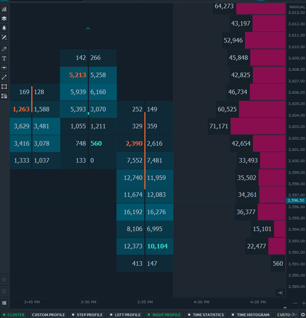
Order Flow Figure #2: Cluster Charts (Optimus Flow Platform)
Order Flow Figure #2: Cluster Charts (Optimus Flow Platform)
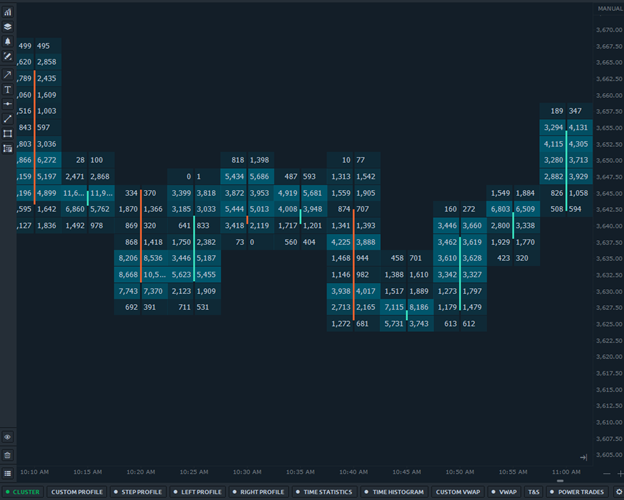
Figure #2 shows a 5-minute Cluster chart (Optimus Flow). The numbers at each price show Bid Volume x Ask Volume.
The Bid Volume is – The number of Contracts/Stocks/Lots that were sold with market orders when this specific price was the Best Bid price.
The Ask Volume is – The number of Contracts/Stocks/Lots that were bought with market orders when this specific price was the Best Ask price.
Don’t confuse Bid Size/Ask Size with Bid Volume/Ask Volume! Volume in this context means “executed orders.” “Size” on the other hand refers to “pending orders.” This distinction is pivotal, with Volume providing insights into past market activity and Size offering a glimpse into the market’s immediate future through open orders.
So, while the DOM shows the limit orders that are waiting to get filled the Cluster charts show what traded at each price.
So what makes the price move? Look at the next figure which shows both the cluster chart and the DOM.
Order Flow Figure #3: A DOM attached to a Cluster chart (using Optimus Flow platform)
Order Flow Figure #3: A DOM attached to a Cluster chart (using Optimus Flow platform)

We see that at the moment this screenshot was taken we had a total of 4 contracts waiting as buy limit orders at the Best Bid price 3596.25 and 2 contracts waiting as sell limit orders at the Best Ask price 3596.75.
The current price is 3596.50. Figure #3 is static but we have to remember that the numbers on the DOM keep on changing all the time because of two reasons (look for the second in the next section):
Reason # 1: When a trader places a buy market order of X contracts, we will right away see a reduction of contracts from the Ask Size at the Best Ask price on the DOM and addition of contracts to the Ask Volume at the Best Ask price on the Cluster chart.
When a trader places a sell market order of X contracts, then we will right away see a reduction of contracts from the Bid Size at the Best Bid price on the DOM and addition of contracts to the Bid Volume at the Best Bid price on the Cluster chart.
Example – In Figure #3 we have 2 contracts at the Best Ask price (3596.75).
If at this moment a trader places a buy market order of 1 contract we will right away see that the Ask Size will change to 1 because the buy market order of 1 contract was matched with 1 of the 2 contracts that were waiting as sell limit orders at 3596.75 and they got filled leaving 1 contracts still waiting to get filled against new buy market orders.
On the Cluster chart, we will see that the contracts that were bought so far with market orders at the Best Ask price will change because 1 more contract was just bought at the market.
On the Bid side, we have 4 contracts at the Best Bid price (3596.25). If at this moment a trader places a sell market order of 1 contract we will right away see that the Bid Size at 3596.25 will change to 3 because the sell market order of 1 contract was matched with 1 of the 4 contracts that were waiting as buy limit orders at 3596.25 and they got filled leaving 3 contracts still waiting to get filled against new sell market orders.
On the Cluster chart, we will see that the contracts that were sold so far with market orders at the Best Bid price 3596.25 will change because 1 more was just sold at market.
Reason # 2: The second reason for the continuous change of the Bid Sizes and Ask Sizes on the DOM is that traders add limit orders and cancel limit orders. Some of the adding and canceling have to do with legit trading decisions, and some reflect manipulation efforts (Spoofing).
So far we understood how price fluctuates between the Best Bid and Best Ask. The next question to ask ourselves is – What is required for the price to move one tick higher to the next Best Ask price or one tick lower to the next Best Bid price?
Order Flow Figure #4:

In figure #4, we see the 2 contracts waiting as limit sell orders at the Best Ask price of 3596.75.
If at this moment traders buy 2 contracts at market then all 2 contracts waiting at the Best Ask price will get filled and we will have zero contracts at 3596.25 which will immediately make 3596.75 the new Best Ask price and the next buy market orders will be matched with sell limit orders at the new Best Ask price 3596.75.
The same story applies to the downside. We need 4 contracts to be sold at the market to get the entire buy limit orders at the Best Bid price of 3596.25 filled and then the next sell market orders will be matched against limit buy orders at the new Best Bid price of 3596.00.
In liquid markets, there are always limit buy orders waiting at the next bid price of sell limit orders waiting at the next ask price, and therefore price moves in one tick jumps.
With less liquid markets the next Best Bid price or next Best Ask price may be more than one tick away, and we may see price jumping more than one tick leaving some price levels untraded behind.
The spread will almost always remain 1 tick in liquid markets (in our experience) because as soon as the Best Ask jumps one tick to the upside traders will quickly place buy limit orders at the level that was the previous Best Ask and is now available for the bids.
Or as soon as the Best Bid jumps one tick to the downside traders quickly place sell limit orders at the level that was the previous Best Bid and is now available for the asks.
During important economic data releases or news events, traders tend to withdraw limit orders, and the book becomes much “thinner” and then even in liquid markets, the spread may increase to more than one tick for a very short time.
Appendix #1 – Advanced Features of the Optimus Flow DOM.
Figure #5 shows the Optimus Flow Chart DOM with a few additional features. You can see 2 new columns.
Figure #5:

The column on the left shows the resting limit orders for the Best Bid price. It sits at 4 contracts. The column on the right shows the resting limit orders for the Best Ask price, it sits at 2 contracts.
If you notice that the Best Ask price is colored at half the length of the Best Bid price. This is because it is in histogram mode.
It is an easy way to visualize whether there are more bids or more asks, in other words; buying vs selling pressure.
Appendix #2 – Advanced Features of Optimus Flow Cluster Charts
Figure #6:
The Cluster chart in Figure #6 displays a few advanced features. The green and red fonts alert us that the diagonal comparison between the Ask Volume, when a price was the Best Ask and the Bid Volume at the accordant Best Bid price, gives a ratio value that is larger than a specific threshold value ( 3 in this case).
The comparison is called an imbalance because the Best Ask price is on the right side of the “x” and is (usually) one tick higher than the Best Bid price on the left side of the “x”. If the Ask Volume is larger than the Bid Volume, then the color is green, and if vice versa is red.
The Numbers Bars are overlaid on top of Volume Profiles which gives us a good visualization of the volume distribution within each bar.
Optimus Flow offers all these tools and more for free when you sign up with Optimus Futures Brokerage. Take advantage of all the order flow tools absolutely free for all customers.
The Bottom Line
Order Flow Analysis can offer a cutting-edge perspective on the markets, shedding light on the real-time forces of supply and demand through the analysis of transaction flows.
This method, distinct from the traditional technical and fundamental analyses, leverages digital technology advancements to track and interpret live data on orders and transactions.
With tools like Depth of Market (DOM) and Cluster Charts, you can now peer into the future with DOM’s live order queues or delve into the past with Cluster Charts’ historical trade data.
DOM provides a forward-looking view by displaying pending buy and sell orders, while Cluster Charts offer a retrospective analysis, showing executed trades at specific prices.
You need both tools to gain a comprehensive picture of the markets when doing an order flow analysis. Both allow you to decipher market dynamics, see potential support and resistance, and anticipate price movements.
As you learn to use these technological enhancements, you may unlock new dimensions in market analysis that enable you to gain a deeper understanding of what drives price changes and where they might be headed. Happy trading!
There is a substantial risk of loss in futures trading. Past performance is not indicative of future results. When considering technical analysis, please remember educational charts are presented with the benefit of hindsight. Market conditions are always evolving, and technical trading theories and approaches may not always work as intended.