This article on TPO Charts is the opinion of Optimus Futures.
TPO charts can be a way to try and understand the larger narrative of whichever market you are trading. They can be used with futures, commodities, forex, stocks, crypto, and others.
Analyzing TPO charts also referred to as the so-called market profile, illustrates the battle for price direction between buyers and sellers. In other words, TPO charts visualize the flow of orders coming into the market.
Please be advised that all illustrations below were created using Optimus Flow as offered through Optimus Futures.
TPO Chart Basics
What is the difference between a bar chart and a TPO chart?
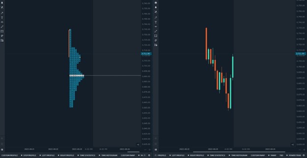
A standard TPO chart is one full day aggregated into 30-minute vertical blocks that are collapsed upon themselves into the Y axis. The key difference between a 30-minute bar chart and a TPO chart is that the X-axis does not have a standard time frame. There is also no OCHL (open close high low).
The benefit of organizing price movement through the TPO chart is that you can view the market through statistical distributions. You will see why this is important later.
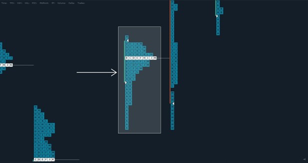
What does the lettering mean?
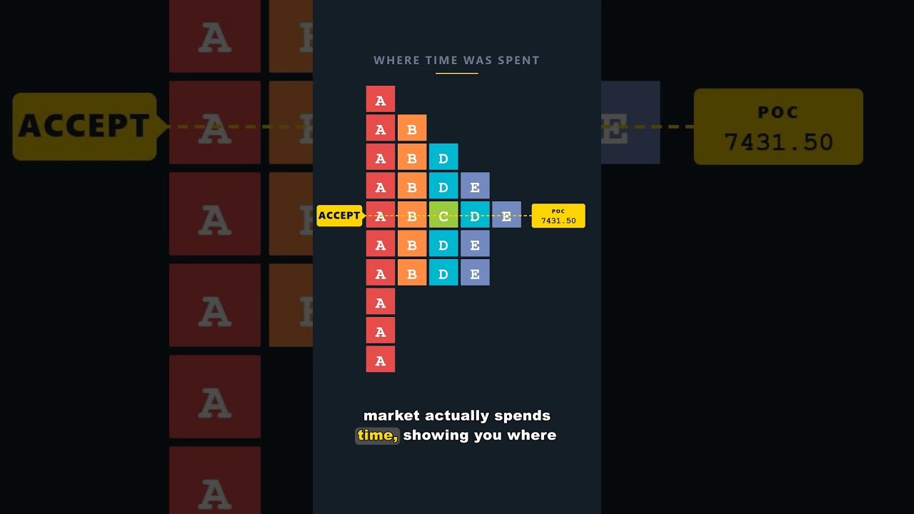
Each letter is considered 1 TPO, and each letter period lasts for 30 minutes. For instance, period A lasts 30 minutes, period B lasts 30 minutes, and so on.
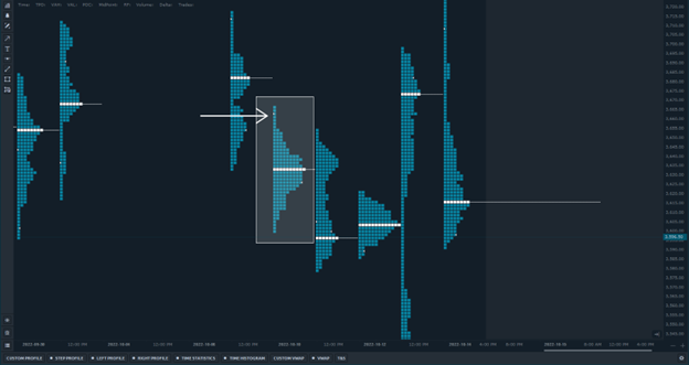
TPO Chart Value Area
The value area is where the price has spent most of the time throughout the day. When trade is facilitated in a price range for longer and longer periods, it indicates acceptance and fair value between buyers and sellers during that day, hence being named the value area.
The benefit of highlighting this area is expressed most in a daily context. If prices seem directionless over the course of a few days, but the value area is overlapping higher, to some, this may indicate buyer control gaining strength which may not have been readily identifiable in any other chart type.
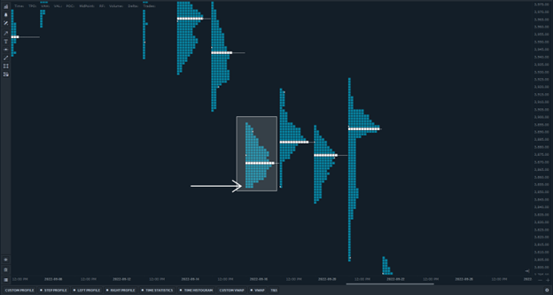
Point of Control (POC)
The point of control is the largest horizontally stacked TPO nearest to the center of the distribution. When trading in a product occurs at the same price over and over, it is a place where buyers and sellers consider the fairest value for the period being evaluated.
Points of control within large balanced distributions often become important reference points for market participants and activity. For instance, when these prices are revisited, the price action from both buyers and sellers is often slow.
This is for two reasons, a sufficient amount of price discovery has already occurred at this level, and large positions are often accumulated and defended in these areas by both bulls and bears.
Important Analytical Concepts of a TPO Chart
Auction Theory
Auction theory is best visualized using the TPO chart. The auction process is a framework to consider price and its rotations over time.
The versatility of auction theory also means it can be applied to all time frames.
When price travels from one extreme to another, it is said to be rotating. Auction theorists contend that when the price turns, it is the end of one auction and the beginning of another.
This constant auction is always in process between buyers and sellers.
These forces use the “auction” to find the fairest value to facilitate trade between them. When prices are deemed too low, buyers may enter the market and impart their view that the price is below fair value.
If prices are deemed too high, sellers may enter the market and impart their view that the price is above fair value.
This concept can be simplified with our basic understanding of what an “auction” is. For instance, when the auction for an item begins, the auctioneer sets the price.
Participants are asked to place a bid at that price or higher when bidding opens. If no one in the room offers a bid (market participants), then there is a consensus that the price is too high or above fair value.
This forces the auctioneer to reduce prices to facilitate interest, slowly reducing the price until at least a single bid is present.
Let’s also consider the opposite. If an auctioneer opens the auction far below fair value, there should be a flurry of bidding activity that brings that price closer to fair value. Depending on the activity, it can push it higher and higher above fair value.
When a standard auction ends, only one buyer is left, the person who is willing to pay the highest price. In the marketplace, this is the end of that auction rotation and the beginning of another. Remember, auction rotations can happen on any time frame, and in the markets, there is often more than one unit available of the asset being traded.
This same process between the auctioneer and the auction participants occurs at the opening bell every trading day. Without considering the overnight session, the opening bell rings, and occasionally the market drops right from the open.
Not enough market participants have bid at these prices, so the auction has forced the market to offer lower prices to attract buying interest. The opposite is true if the market opens far below fair value; there should be a flurry of activity that drive prices higher.
ALSO READ | Deciphering Order Flow – Understanding The Mechanism That Moves Price
The TPO chart can help visualize this auctioning process as it occurs in the marketplace, as you will begin to see.
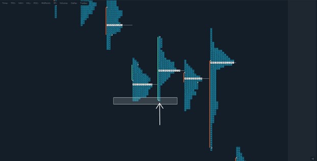
Excess
Similar to a wick/tail on candlestick charts, excess is classified as at least two TPO lengths at the bottom or top of a distribution. On a TPO chart, excess signifies the natural conclusion of the auctioning process, whereby the price has traveled too far from value and has been auctioned back into value.
When a TPO chart is missing excess, it is said to be an unfinished auction. This concept, to many, is powerful and can be, in theory, used to the day traders’ benefit. Remember, the auction process can be applied to any time frame.
This image shows a balanced distribution with excess on both the buying and selling sides. This tells traders that both active buyers and sellers came into the market when the price drifted far enough from perceived value.
This image shows an aggressive buying tail.
This image shows an aggressive selling tail.
MORE | An In-Depth Guide to Backtesting Trading Strategies (including TPO Chart)
A poor high or low is when there are two or more horizontally stacked TPOs at the highs or the lows. Price has visited this area in two different TPO periods without creating meaningful excess. In other words, an unfinished auction.
Daytraders can use this information provided by the TPO charts to determine the strength or weakness of the current auction. Without meaningful excess, the current auction becomes vulnerable to tests of the poor structure.
Different time frame participants
The marketplace is made up of different participants that operate in different time frames. Each time frame has its own expectations and behaviors.
Market participants can fall on a spectrum from high-frequency algorithmic trading (less than 1 second) to long-term investing (10+ year time horizon). Participants can drift in and out of the time frames they operate within if their circumstances change or if economic conditions change.
For simplicity’s sake, it is our view that it is most beneficial and practical to think about market participants as being shorter time frames (day traders, algorithmic traders) and higher time frame traders (longer-term investors, swing traders).
Shorter Time Frame
These participants typically open and close their positions within the same day. They are less patient, have weaker directional convictions, and are often used as middlemen between higher time frame buyers and higher time frame sellers.
They often rely on price action patterns, obvious visual support, and resistance areas. These participants are often “weak-handed” and are more willing to change their directional bias.
Higher Time Frame
Higher time frame participants’ activity is more nuanced and difficult to decipher. Their activity is most obvious on trend days.
These participants have more directional conviction since their expectations are much longer. They are less concerned with day-time frame price movements once they initiate a position.
Weak Low
A weak low, similar to a poor low, can be considered an unfinished auction. These weak lows are obvious mechanical price levels such as pre-market high/low, previous day high/low, gap locations, etc.
When an auction stops at these areas and turns, this can indicate that traders are active in a shorter time frame. The auction has been halted at these prices in an almost synthetic manner and pushed away from these prices by traders whose behavior is typical of weak conviction.
In other words, these areas become vulnerable if ever revisited. The TPO chart is a great way to visualize these weak structural areas because they remove statistical noise that is present with other chart types.
Distributions
The key benefit of the TPO chart is being able to view the market as a statistical distribution. This helps organize the data intuitively. Thinking about the TPO chart as a vertical bell curve is helpful in understanding price extremes.
In a balanced profile, the flat part of the curve are areas of the profile furthest from value. They represent the statistical extremes of the day. In other words, the most discounted or the most overpriced areas. The next section will discuss how different distributive shapes mean different things.
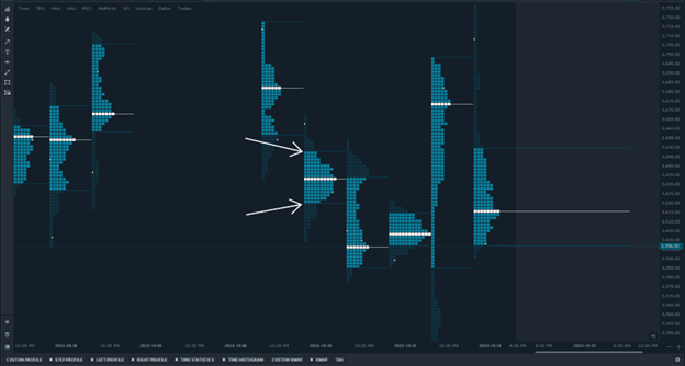
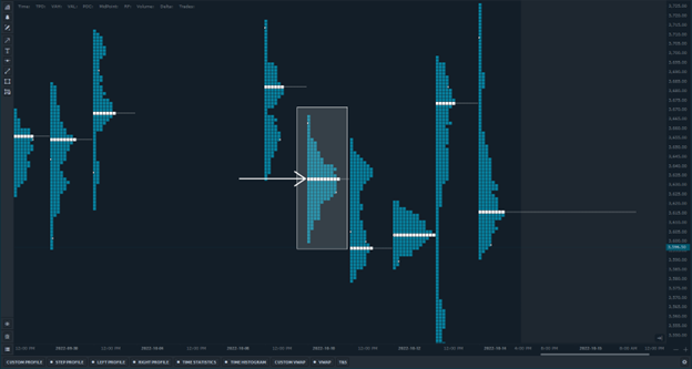
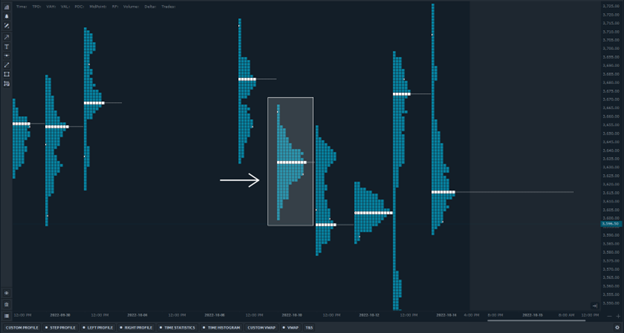
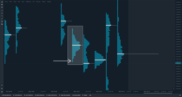
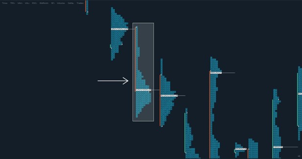
D Shape
This is the most balanced distribution and the basis for all TPO structures. D shapes represent higher time frame buyers and sellers in balance, with excess on either side and a large value area where price has facilitated trade over time.
As previously stated, an excess represents overpriced or underpriced areas (the flat part of the curve) and indicates where the highest risk to reward was during the day.

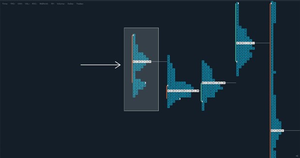
P Shape
P shape is a large buying excess that usually occurs off the open and never gets revisited during the day. It is called the P shape because that is the shape that the TPO chart makes.
The P Shape occurs because aggressive buyers came in and left single prints. The high of the day usually has a smaller D-shaped (balanced) distribution at the top. P-shaped days can occur for several reasons, but they are mostly characterized by swift emotional buying.
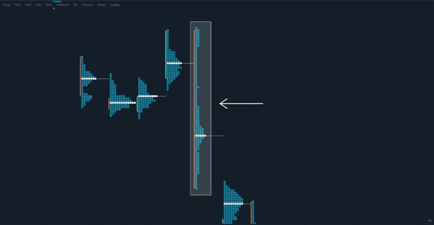
b Shape
The opposite of the P-shape is the b-shape. Note this is a lower case “b”. The exact same situation, just on the short side.
B Shape
B shape is a day with two balanced distributions – note the upper case “B”. These days can start lower and end higher or start higher and end lower. The main characteristic is an area of low trade facilitation in the center of the profile. This is an area where price quickly traversed, using it as both support and resistance on the same day.
Trend day
A trend day is characterized by being elongated and having no significant distributions. This is because the price has not spent a long enough time at one level to build balance. It has rotated in one direction consistently throughout the day.
Often, higher time frame buyers or sellers are responsible for such rotations. Typically, the larger the trend day, the more participants that are drawn into the market, and the more the trend becomes self-fulfilling.
Understanding how to read TPO charts can give you an advantage over other traders. Deciphering value areas, points of control, and other characteristics of TPO charts can provide great context to a daytraders decision-making process.
There is a substantial risk of loss in futures trading. Past performance is not indicative of future results. When considering technical analysis, please remember educational charts are presented with the benefit of hindsight. Market conditions are always evolving, and technical trading theories and approaches may not always work as intended.